
Just putting them out there for reference and discussion.
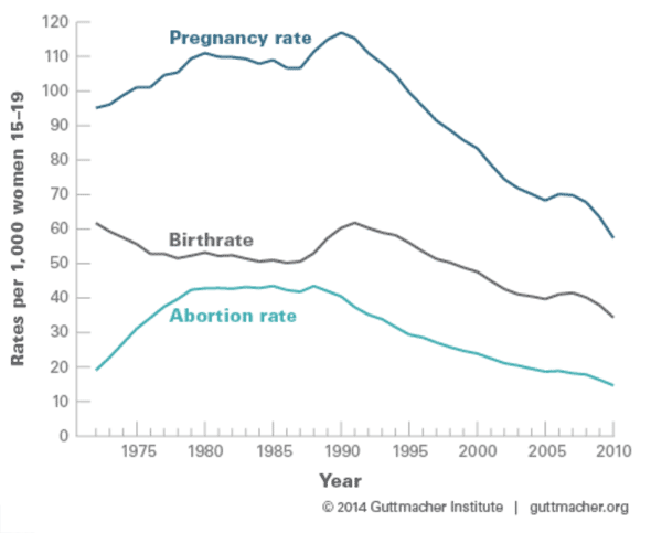
While there was a substantial drop in the pregnancy rate for 15–17-year-olds and 18–19-year-olds between 2008 and 2010, pregnancies among 18–19-year-olds constituted the majority (69%) of teen pregnancies. During this same time period, increasing proportions of 18–19-year-olds reported having ever had sex, yet fewer of them became pregnant. The likely reason is improved contraceptive use and use of more effective methods.
If teens are more likely to have sex, that’s a reversal of the recent trends reported by a paper in Pediatrics:
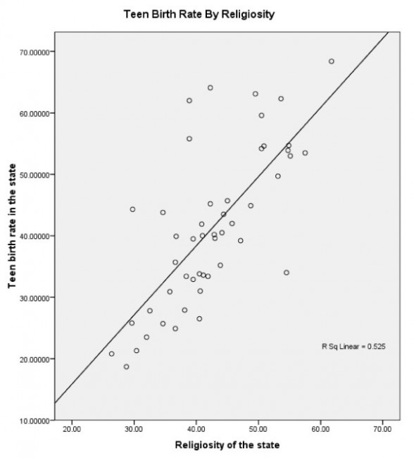
The statistical significance of this relationship survives controlling for mean income (more religious states tend to have lower mean income), and, of course controlling for abortion rates (if states with higher religiosity have lower abortion rates then higher teen birth birth rates would not necessarily be a surprise).
I’d also highly recommend this post from Slate Star Codex on abortion and contraception usage.

It would be interesting to see the effect of controlling for income. It would also be interesting to see a breakdown by race, and by population density (i.e., rural/suburban/urban).
RonF, a breakdown by race is available at The National Campaign to Prevent Teen and Unplanned Pregnancy.
As a quick test, I plotted data by state from that against state median income and urban population percentage, both from the 2010 US census. (Lots of variables compressed there, but I couldn’t find something more principled.) Here’s teen pregnancy rate vs median income and teen birth rate vs median income; here’s teen pregnancy rate vs urban population percentage and teen birth rate vs urban population percentage.
Now, there’s lots of variation within states, so this is by no means a definitive diagnostic of what’s happening. But I’m really interested by how the pregnancy rate (but not the birth rate) varies with the urban-vs-rural distribution. What is that probing? Greater access to abortion services? Less religiosity in urban areas? The urban-vs-rural will capture some of the differences with race, but I wouldn’t have expected it to make such a large difference in pregnancy vs birth rates…
Harlequin, something seems wrong with your plots: the urban population percentage values should be consistent between plots. Instead, urban population percentage values are higher in the birthrate plot (e.g. 8 states above 90% vs. 1 state, 2 states below 40% vs. 7 states below 40%). Looking up the urban percentage values, it looks like the values in the birthrate plot are correct. Looking at the pregnancy rate and birth rate values in the plots vs. median incomes, it looks like you transposed some columns in your plots vs. urban population and your birth rate vs. urban population percent is actually birth rate vs. pregnancy rate (which explains why it is a pretty good correlation).
Ha, that would make sense! I’ll blame the Google Charts API. Yep. Totally their fault. *nods* Nothing to do with me at all…
Here’s the right one. Little to no correlation this time.
:)
Notably, the two really low urbanization states with really low teen pregnancy rates are Maine and Vermont. And I’m going to bet that really low pregnancy rate state at ~60% urbanization is New Hampshire.
Yes, that’s New Hampshire. (Sorry, couldn’t figure out how to label the points.)
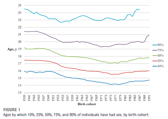
So basically the sexual revolution took 2 years off the age of virginity loss between 1965-1990. It really makes you wonder how low that blue line would have gotten if AIDS hadn’t come along and changed sexual mores.
There’s a big delay if the inflection point in the lines is caused by AIDS. After all, that’s birth cohort; we’re talking about, on average, 17-18 year olds when they start having sex. The lowest dip seems to be birth cohort 1975-1978–teens who on average started having sex between 1992 and 1996, when the death rate from AIDS was at its peak.
I’m sure there was a delay in, say, how school curricula addressed safer sex, how society viewed risk of AIDS to straight people, etc. But was it that long? (Actually asking, not rhetorical.)
Eyeballing the lines stop falling in 1975 which +14-17 gives 1989-1992. The 1st national public awareness campaigns were 1988 as was the 1st world aids day. Magic Johnson and Pedro Zamora started campaigning 1991. Most the big mainstream cultural stuff happened after, that Philadelphia was 1993, Kids was 1995, etc.
I wouldn’t worry about peak death rate, that’s just down to antiretrovirals. Kids aren’t likely to get HIV, this isn’t really about the reality of risk just how it was used culturally.
It also looks a lot like the inverse of the lead exposure trend lines.
For what it’s worth, here’s the 12/30/13 National Vital Statistics Report entitled Births: Final Data for 2012. Table A lists birth rates for women 10-19 by age, race, and Hispanic origin, 2011 an 2012. Table B has birth rates for women 15-19, by state.
And last Thursday they released Births: Preliminary Data for 2013.
You may have heard that 72% of black births occur out of wedlock (see the 2012 report, pp. 8-9). You may not have heard that the rate of black out-of-wedlock births has been declining since 1990. Damn Clinton and the moral tone he set for the nation!
So how do we get the 72% figure? The rate of black IN-wedlock births has been declining since 1970!