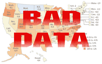
Yesterday I posted the above map, and I see that many lefty bloggers have done the same. However, as Jane Galt points out, the data behind the map was put together very poorly, and the statistics given on the map have little validity. (Thanks to Nobody.Really, who pointed out Jane’s post in comments).
Kevin Drum has posted more accurate data; although it shows that median incomes have indeed dropped in most states since 1999, the situation is not as dire as the inaccurate map made it seem.


Pingback: feminist blogs