Not too long ago, I received from my publisher, Guernica Editions, the final proof of the cover of my new book of poems, Words For What Those Men Have Done and I am really happy with it. The design, of course, is the work of Guernica’s Allen Jomoc, Jr., but the concept is largely mine:

Almost from the moment Words for What Those Men Have Done started to take shape in my imagination as a book, I thought of it as a companion to my first volume of poetry, The Silence of Men, published by CavanKerry Press in 2006. The poems in both books emerge from the same set of concerns about how the sexual violence I survived as a child has shaped my life as a man and how I, as I live that life, try to hold myself accountable for what I have learned as a survivor. I chose Words for What Those Men Have Done as the title—it’s a line from the last poem in the book—because I wanted to move from the act of breaking silence, which is what I did in The Silence of Men, to the act of holding “those men” accountable. From exploring, in other words, what it means to say, out loud and without shame, I was sexually violated to claiming the consequences of refusing to be silent. I wanted the covers of the two books to reflect that progression as well.
This is the cover for The Silence of Men, which I think is gorgeous:
Peter Cusack, CavanKerry’s Design and Production Manager at the time, actually painted that image in response to the poems in the book. In fact, the painting now hangs above my piano:

It’s a very striking cover. In fact, telling its story, i.e., that Peter painted it, has helped me sell not a few copies of the book over the years. What struck me as I thought about the connection I wanted to establish between it and Words for What Those Men Have Done, however, was my sense that the man on the cover of The Silence of Men is, at one and the same time, a man being silenced (by flowers!) about things that have happened/been done to him and a man being silenced about what he has witnessed—about, in other words, things that happened to others, that he has seen, and that he does not yet have words for.
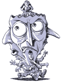
So, when Guernica’s editor Michael Mirolla asked me for concept and art suggestions for the cover of the new book, I went looking through the images I own for pictures that would do two things: carry over the theme of bearing witness from one book cover to the next and suggest the process of finding a way to communicate the trauma that was witnessed.
The first image I found is one that I’ve used on this blog before, which reminds of the kind of self-portrait a child who’s been violated might draw when asked to by, say, a therapist:

The second image I sent Michael is also one I’ve used before, a man’s eye looking straight ahead through a pair of glasses:

It turned out, though, that I didn’t have a file with high enough resolution for that image to work, and so Michael suggested the picture that we ultimately used:
 The result is not just really cool on its own; it interacts with the title, Words of What Those Men Have Done, in just the way I want it to, while also carrying over the themes from the cover of The Silence of Men in just the way I was hoping for:


Richard, I post here not about what you’ve written, but about something I think might be if interest to you. For all I know you have already seen it. But have a look at this, please. It’s about poetry, and prayer, and it’s written by a young American from Iran.
Thanks, Martha. I appreciate it. I haven’t read the essay yet, but I have bookmarked it.
Both covers look amazing. And although I’ve admired the cover of “The Silence of Men,” before, I didn’t realize that the art director had painted it for the book. That’s amazing!
Thanks, Amp. The images in the post are a little misleading, though. Guernica produced Words for What Those Men Have Done at a much smaller trim size than my first book and so they don’t look as much like a two-volume series as I was hoping. But that should be my worst publishing problem ever, right?