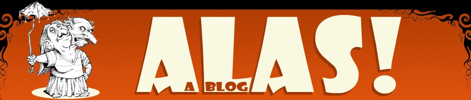
This is a design for the banner that I’ll be hanging behind my table at Stumptown, where I’ll be premiering the dead-tree edition of Hereville. The banner is planned to be eight feet wide by three feet high (gulp). I’ll be hanging it from a mounting device I’m building myself out of PVC pipe. It feels more than a little embarrassing — there’s nothing in the world I hate more than selling myself — but I’ve decided I really want to go all-out on this.
So the first question is, what do folks think of the design? It’s really just a variation of the webpage header.
And my second question is, how high off the ground should I get this? The plan I downloaded is for an eight foot high display, so the banner would start at five feet off the ground and end eight feet off the ground. Is that high enough, or should be using a nine foot or ten foot plan instead?
Any advice would be appreciated.
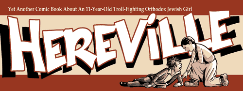
UPDATE: Second attempt:
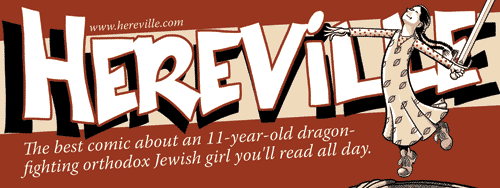
UPDATE AGAIN: Second attempt, slightly tweaked:
That’s an awesome design.
As I said on the phone, anywhere above table level is a good bottom height, and the top height no less than 7 ft.
All the cool kids have ten-foot displays.
And Cabbage Patch dolls.
(I’m sure eight feet is plenty. The top of the banner will be two feet above eye level, even for tall people.)
So, uh, slightly off-topic, and this question seems kind of dumb, but I’m going to ask anyways. Why is the comic called Hereville while the name of the town is Aherville?
What is average eye level? I’d say the bottom definitely should be at least 6′, right? You don’t want people having to crouch and duck to get under the banner to find out more. The higher you go, the more open and accessible your table/booth/whatever will appear. Plus, the higher you put it up, the more it will catch the eye among a sea of other table/booths.
I believe,
NobbyBjartmarr, that it is what is known as a pune, or play on words.“Aher” is Yiddish for “here.” Hence, “Hereville.”
Or that’s what I thought when I made the names up. Now I’ve read a different claim, so now I’m just unsure. :-)
Oh, I see. Not knowing Yiddish, the link wasn’t really apparent to me. And if I had known Yiddish, it wouldn’t have been apparent to me.
But that’s okay; comics have a long tradition of retcons. I’m sure you’ll think something up. ;)
(“Ah, yeah, well, whenever you notice something like that, a wizard did it.”)
I would go taller. If there is a crowd of 6 footers at your table, then 1/3 of your planned banner is blocked. Plan for the crowd – have the bottom of the banner start at 6′.
The design is OK. The tagline on the website is cleverer (more clever? has greater cleverosity?) than this one. And the picture is kind of weak to people who don’t know what the heck is going on. Did that girl push that boy down? Is she dragging him along the ground? Is she helping him up? Is he the troll? Is she? Where’s the troll, anyway? I would replace the vertical boy with a vertical sword, being raised two-handed by Mirka (i.e., like she’s just picking it up and is coming up from a kneeling stance with her weapon), and put some grim determination in her face.
Banner height? Depends on the setting. I trust you know the setting better than I. I imagine you being seated at a table. So if I were expecting a packed convention center, then I’d want to banner higher, to attract attention from across the room. If I were expecting a relatively sparse crowd/closed-in space, then I’d want to banner closer to your head. You can fudge the two options by raising the level of your head – that is, sitting at a high table with a bar stool.
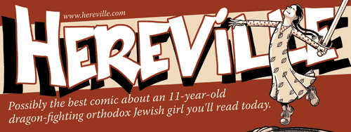
I love the tag line. But now she’s a troll-hunting girl rather than a dragon-hunting girl? Probably a better fit for the current book.
I also like the illustration. It demonstrates Mirka’s capacity for compassion without fuzziness. That said, I expect Robert has a point: I don’t know that the illustration speaks to people who don’t already know and love Mirka. To reach people quickly, you need what they put in movie trailers – a little humor, a little sex, a lot of quick violence.
I fear that an actual depiction of the moment Mirka gets her sword may be a bit of a spoiler. But, hey, movie trailers are often big spoilers; that’s what sells. Something like Robert’s suggestion might attract more attention.
Velma, at comic book conventions — maybe not at San Deigo, but at the more normal-size cons — banners are behind the table, not in front of the exhibit, so there’s no “walking under the banner” concern.
Robert, what tag line are you thinking of that you like better? There have been a bunch of variations, so I’m not sure which one you mean.
Robert and N.R., I’ll think about the image. I’m not married to this particular image. But at the same time, I don’t want a banner that implies violence. Not only would a violent image not represent the book well, I think that in the context of a comic book convention, I can stand out more by choosing an image that eschews violence.
Plus, I don’t really like the way I draw swords, so I’m hesitant to make a drawing of a sword that’ll be blown up to six feet wide. :-)
I think I’m sold on a higher banner, so I’ll work on making the banner stand at least 9 feet high (so the bottom of the banner will be six feet off the ground). I’m worried that the taller I go, the less stable it’ll be, but I still have time to trial and error with PVC structures.
Bjartmarr, you got it. Retcons make the world go round. :-)
Oh, and I changed “troll” to “dragon” at some point when I was working on itty-bitty ads for “Hereville” to appear on other comic books’ websites; there’s so little room that switching to a word that’s less wide made a lot of sense.
I’ve actually been wondering if I should do an extremely minimal tag line — “11 years old. Jewish. Fights trolls.” — so the lettering can be larger and visible from further away.
Yes. If you can make the tagline funny AND short, that’s better.
The one I liked was the one that started “the best comic book about a…”
I’ve posted a second design — see the update to the post.
I like the “yet another” line better than the “possibly the best” line. The latter is more complicated and less funny. “11-year-old troll-fighting orthodox Jewish girl” is wordy enough already.
The slanty design is marginally better than the straight-across one.
I have no opinion on which Mirka to use, other than to say that you could probably lose the sword without detracting from the effect.
I’m very bad at graphic design, so you’d probably do better ignoring my opinion. :)
Well, in this particular case I’m going to ignore your opinion, because I like the “all day” tag line better (although I did reword it a bit, at Mandolin’s advice). But I appreciate you giving your opinion regardless. :-)
Much better. I wonder if the tagline text would look better without being on the slant, though.
I like the last one the best, but think that you should try to keep “dragon-fighting” on the same line, if you can.
It looks like she’s dancing with that sword. Interesting juxtaposition of her character and her actions. I think it expresses the comic well.
Isn’t Orthodox usually capitalized?
Yeah, it should have been capitalized. Oh, well, too late now. :-(
I’m glad you like the image, Ron. It’s taken from the front cover.
Sailorman, I agree it’s better to not split dragon-fighting, but not splitting it would have made the two lines very uneven in length, and also required me to use a significantly smaller font size. I decided in the end that being readable from further away was more essential to me.
Robert, I played around with the tagline both with and without slants, but decided slanted looked better. It’s a pretty close call, though.
Well, it’s OK with me, but I’m going to hire a bunch of nerds at the con to come up to you and say “shouldn’t orthodox be capitalized…”